Where the energy goes
A house with solar panels asks three questions all day long: what am I producing, what am I consuming, and what does it cost? Sowel answers all three on one screen, from any meter you already own. This is the tour.
Part 1: The three answers
Right now: the Live page
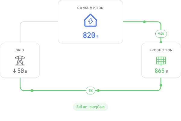
The Live page is the instant picture. Three figures and two flows: what the house draws, what the panels produce, and what crosses the meter in which direction. When the panels cover the house, the page says so in one phrase: solar surplus.
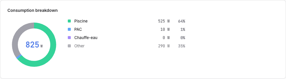
Below it, the consumption breakdown says where the watts are going, live, per metered load. A pool pump filtering at 525 W is 64 % of the house at that instant; the rest is the fridge, the router, the life of the house, grouped under Other.
A load whose plug has gone quiet for too long reads reading outdated, with no figure and no share, rather than showing the last value it sent. "Too long" is two minutes for a declared meter, which the engine already expects to report continuously, and ten minutes for anything else, because several integrations poll on a five-minute cycle and a healthy appliance must not flicker in and out on every poll. That matters more than it sounds. A stale 0 W looks exactly like an appliance that is off, and nothing on screen would tell you the number was a quarter of an hour old. It also matters most during surplus, because the house total is then a small difference between two large numbers, so a leftover reading can dwarf it (issue #744).
Over time: the Consumption page
Day, week, month or year, with one bar per hour or per day. Two things make this page more than a chart:
- Peak and off-peak hours are colored on the bars. You do not read a schedule; you see it, bar by bar, exactly as your contract slices your days.
- One toggle switches the whole page from kWh to euros. The same month reads either as energy or as money, with the peak and off-peak split priced separately: a month at 65,62 € of grid electricity, of which 47,81 € at peak rate, tells you more than 534 kWh ever will.
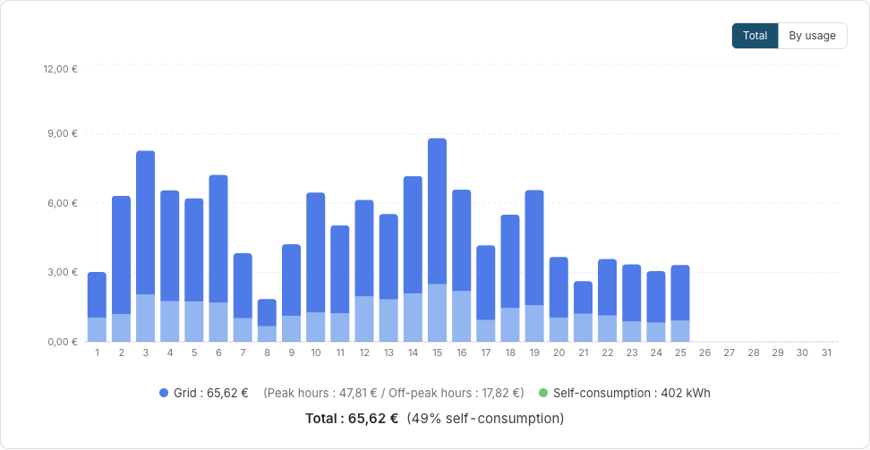
The view can also split by usage: each submetered load gets its own color in the bars, so the pool, the heat pump and the water heater carry their share of the month visibly.
What the panels did: the Production page
The Production page splits every bar in two: what the house consumed of its own solar power, and what was injected into the grid. Self-consumption is the money question of a solar installation, and it is answered per day, per month, per year:
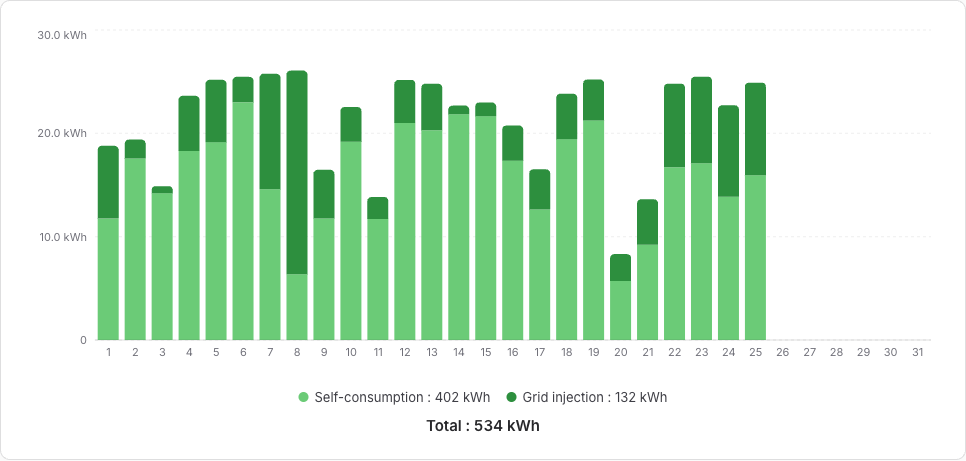
Below the chart, two more cards watch the installation itself: the production forecast (what the panels should produce today and tomorrow, and how accurate the forecast has been) and panel health (whether the installation still performs at its usual level, judged on clear days only). Both deserve their own story: the forecast and health monitoring, and the surplus arbiter that puts the surplus to work.
Setting it up: two declarations
Everything above comes from two things you declare once.
1. Meters, as equipments. Sowel is integration agnostic: any plugin that reports power or energy on a device can feed the pipeline. You bind your devices to three kinds of equipment:
- a main meter for the grid exchange (a Shelly EM, a Linky reader, anything that sees the mains);
- a production meter on the solar side;
- submeters for the loads you want to follow individually. A cheap clamp that only reports watts is enough: Sowel integrates the power signal into an energy stream locally, and the state survives restarts.
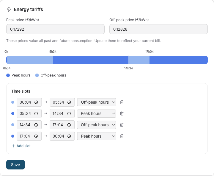
2. Your tariff. In Settings, Energy: your peak and off-peak time slots, drawn on a 24 h timeline, and the two prices. That single declaration colors the consumption bars, prices the euro view, and feeds every cost figure in the app.
Part 2: Under the hood, briefly
This article stays light on purpose; the details live in the energy monitoring guide and in the two companion deep dives. Four facts are worth knowing anyway:
- Everything is local. History lives in an InfluxDB that ships inside Sowel's own Docker deployment: raw data for 7 days, hourly aggregates for 2 years, daily aggregates for 10 years, downsampled automatically. No cloud account, no data leaving the house.
- The self-consumption split is computed at the meter, minute by minute. Self-consumed power is what the panels produced minus what was injected, clamped so that meter drift between two devices never invents energy.
- Day boundaries are your midnight. Aggregates respect the local timezone, so the bar labeled Tuesday contains Tuesday.
- The tariff classifier follows your declared slots, including slots that cross midnight, and the peak and off-peak totals shown under the chart are computed from the same classification that colors the bars. What you see priced is what was measured.
Where to go next: The surplus arbiter explains how the surplus you see on the Live page gets shared between your flexible loads. Watching over the panels explains how the forecast learns your installation and how a silent fault gets caught.